Wednesday, April 20, 2016

Harlem Candle Co. Packaging Design

I have had the pleasure of working with Teri, founder of Harlem Candle Co. for about a year now.
She came to me for a logo upgrade and needing packaging and labels for her candle line.

Truth be told, I actually really liked her logo.
Usually when clients tell me that they need help with their logos, they do.
The story usually starts with

My Mom (or, best friend, 12 yr old nephew, boyfriend etc) got a copy of Photoshop and created this logo for me...

Coincidentally, Teri's logo story started the same way, however in this case, her Dad ;-)
1. Was smart enough to use Illustrator to create a vector based logo
2. Kept it simple and clean looking
3. Has talent!
I tweaked a few details, made some slight typography changes but by and large, the essence of what he had created stayed. I thought he had done a great job!

Teri had been using labels on her various candles before coming to me, however, this time, she wanted her new labels to really reflect where she was taking the line, with luxurious new fragrances and new glass vessels. She also felt that she was ready to take things to the next level in terms of her brand and wanted me to design some custom packaging for the line

We started by creating the labels for both beauty and utility ; a label for each fragrance in a rich saturated corresponding colour and a gold foil. Since custom boxes can get expensive and Teri was starting this venture with a small-ish print run, we opted on only one box design for all the different fragrances. I did this by creating an area on the front of the box that could accommodate the same label as the vessel, so every boxed candle would have a label on the front of the outside of the box and on the glass candle vessel. Since we could use the same label, it increased her label volume and thus, ended up bringing her (per piece) label price down, so it worked out perfectly. By only creating one box at this point, it also ruled out some of the pitfalls of printing lots of different custom boxes, like running out of some and having overstock on others. With this scenario, we only had to worry about labels. Plus, Teri could introduce new fragrances by only adding a new label to the existing box.


I stayed with the classic black and gold of the original Harlem Candle Co. aesthetic for the boxes and created an all over pattern using the H, accented by spot gloss on the H's. This gives the box some texture and although the H pattern is black on the black background, it stands out in a subtle way depending on how light catches the gloss and resembling custom wallpaper. On the inside of the box, Teri was granted permission by the family of the late artist Elmer Simms Campbell to use the amazing illustration of his Harlem Night Club Map.


In March, Teri presented her all-new line in her exquisitely designed booth at the Architectural Digest Design Show in NYC, it was a huge success!

We are working on her next new ideas together and I'll be sure to keep you in the loop.
You can enjoy these beautiful candles in your own home, (I have burned several and the fragrances are divine), definitely order a few for yourself or someone you really love!

Monday, January 18, 2016

Private Label Candles

Happy 2016!

This year I am not going to call it anything, like a resolution, I am just going to do it.
So, let's do this.

First up, Private Label.
I know I get retailers and wholesalers and designers and event peeps here, (because you write to me, and I enjoy that), so I thought this might be fun to share, plus I'm super excited about it.

Just launched,
the Private Label Boutique with my awesome clients Scentations Home Fragrance.
What is it, you ask?
It's a small-batch run program starting at just 100 candles.
Scentations is a 30 year old, second generation family run home fragrance company that makes beautiful candles and home fragrance products in Pocahontas Arkansas. They have been taking care of large private label accounts for many years, but now, I have helped them design a simple and affordable way to offer custom candles to smaller retailers, for events or corporate opportunities.
It's a super simple process where you choose your vessel (4 offered), your fragrance (over 20 offered) and your label shape and style (designed by yours truly).
It honestly could not get any simpler. We can also add your logo and use your requested colors.

If you are planning an event or have always wanted to create your own line of custom candles for your retail environment, event or even your design business,
you should definitely get in touch with Scentations.


Tuesday, January 6, 2015

The Mock-up; From an idea to a booth

Happy 2015!
I decided not to wait another 2 years before my next blog posting, :-)
I have been asked over and over again - Nadine, how do you come up with fresh booth ideas for smaller companies who don't want to spend a gazillion bucks and who want an awesome booth but with a relatively quick set up and tear down.
Here it is, my (now) not so secret process.
I start with A LOT of thought, much is pretty straight forward, but each case is always a little different. I think about the product that is being sold, how it will be sold at retail, who I want to sell it to, and, what type of a setting suits the product. I go through the obvious list of what the exhibiting company has or has not already done in terms of a booth pre- Nadine.
Do they have a catalog? great photography? full on branding? or maybe things are a little scattered look-wise, maybe we want to make the look more cohesive and pardon the expression "on brand" (ugh). So many questions, but SO important to know before you start to mock things up.
...How big is the booth? (usually my client's booths are between a 10x10 and 10x15), how many products do we need to show? do we want to do a lot of repeat? ie: 12 of each item? if there are only a few items in the line, or, is the line vast and the booth space limited?

Now, what about style? Visual inspiration.
The line could be gorgeous dainty jewelry, but how am I going to get buyers out of the aisle and into this booth to take the time to look at the gorgeous dainty jewelry, when there's a daiquiri machine a few booths down and a clown and puppies? (not quite, but almost)

Does my client's line have great style already? or does it need to find its look? Is there something in the line that can inspire the entire look of the booth, maybe a great photo in their catalog that can get the ball rolling?... How extravagant can I get with this booth? What's the budget? Can we ship in 10ft antique armoires?, yeah, didn't think so.

I happen to think in images, I can build a booth in my head first, literally swapping out fixtures, paint colors and signage with my eyes closed, lying in bed. Odd? probably, but it's how I roll.  Funny thing is, when I was doing my own booths, I rarely did any kinds of visual mock-ups, I imagined my booths and simply made lists. (When I look back on it, I probably would have saved some time by mocking it up after imagining it, but too late now). Most of my clients are not into the whole imagining thing, understandably, they want to see it, or something very close to it, before they show up in the booth, so I create mock-ups, and that is what we are going to talk about today.

I am going to take the initial launch of the lovely Eleven Point - Fragrance Merchants line, this past summer. Before we did anything in terms of a trade show for his newest brand, David (the owner) wanted to see something that he could really sink his teeth into, all the pretty words and descriptions weren't going to cut it, he wanted visuals. Here is what the very first mock-up looked like.

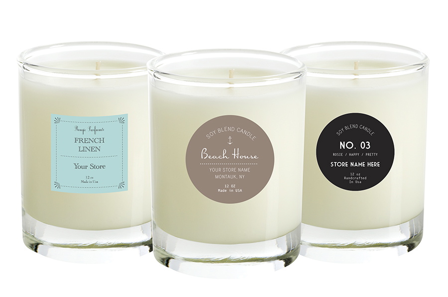
A little background, the line is inspired by nature, the fragrances, memories and experiences David and his family had growing up on the Eleven Point River. The initial launch would show 6 different fragrances in 6 different product categories (white glass vessel candle, black glass vessel candle, reed diffuser, room mist, travel tin candle and fragrant sachet). The line was designed to coordinate in rustic or modern settings, for women or for men. To have a lived-in comfortable, relaxed look with sophistication and elegance, focusing on the amazing fragrances of the line; River Fern, Bonfire, Cotton Creek, Honeysuckle Rain, Coconut Moon (my favorite) and Blackberry.

Charcoal painted walls with the box pattern as wallpaper down each wall, gold wall sconces, signage like the brand's packaging, two perfectly weathered leather club chairs, one large wooden wall shelf, large nested table set and weathered wooden floors. I knew this was simply a jumping off point to get things moving along, it might not all be feasible, but we needed a start. Also, when starting with a mock-up like this, you can really walk through a few orders in your head and really think about what you need in your booth in terms of supplies and what you need to show in terms of product. And yes, it's a wholesale show and buyers know how to buy, but buyers are also regular people who shop too, so I like to think about what I like, what attracts me to a store, how I like to shop.

It just so happened that before doing the Eleven Point booth, reps and showrooms were hired, so we quickly switched things up for the limited space of a showroom. Here are the mock-ups.

Dallas showroom, approximately 8 feet of wall and approx 6 feet of floor. 
Here's the Mock -up
in progress
end result (very bad photo/color)
Las Vegas showroom, 8 feet of wall with about 10 feet of floor.
Wait, what now? I can have ceiling electricity?... we can do this.

They might have a table we can use? it's rectangular? okey dokey.

result (excuse the photo quality, it's all they sent me!)
 
 Atlanta - variation on the same theme, again with a round table

You are getting the idea now, right?
For technical info, I use Adobe Illustrator to create these mock-ups, truth be told, I wish I could use Illustrator for everything, it's amazing. But if you are not into the big guns software, you can certainly use other things, or even draw it out, or make your life a little simpler and call us.
(please note that we were NOT present for any of these showroom set-ups, they were done by the showrooms themselves based on our mock-ups, and, they did a great job! This go around of shows, I am getting really detailed about exactly where we want product displayed and on how many samples are sent to each show, you will see that soon, Atlanta is being set up right this second as I type this post :-)

Here are few sources for items that were used in the showrooms - round table in Las Vegas Showroom, battery powered wall sconces were purchased on ebay for all showrooms, custom self-adhesive wallpaper.

Next up, how we tried a few looks before settling on this NY Booth last summer.

Monday, December 22, 2014

Eleven Point - Booth Design

It has been forever. UGH. My apologies.
Lately I have had so many emails and messages and even a few phone calls from you awesome people who tell me that you are waiting for me to post more booth stuff.
Good news. I have new booth stuff for you.
It's actually from August 2014 NY NOW. Pretty new.

This is the Eleven Point Home Fragrance booth. It was on Pier 94 and the newest brand introduction of my awesome client Scentations Home Fragrance. I love love love working with this company, and am so proud of what we created for Eleven Point. I will post more about the line separately, but let's get to what you are asking for, the booth stuff.

This was a 10"x10" corner booth. As with most of us, they didn't want to spend a gazillion dollars on a booth but, they still wanted a presence. The goal was to create a little wholesale shop where buyers could see the line, quickly understand the line, experience the fragrances and place orders.
The NY NOW show is offering some new options for walls these days, so there was no need for foam board this time. We decided to order the MDF panel option and have them paint it for us, you just need to supply them with the Behr paint color (I chose a charcoal grey). We needed 2 ten foot walls done (since we had a corner). On the Piers we did this through FB International (via the show). The pricing was somewhere around $150 per panel (painted) and we needed 6 panels (they cut them and price them to just a little over 3' each since most of the booths are sold in 10' increments, if you go to Lowe's or Home Depot, they will be 4'x8' and you will pay around $25/panel unpainted), the unpainted was $120/panel. Not cheap. I know.
If you are local, the process they used to make the walls was super simple (explained below) and it could be easily done for WAY cheaper, but, if you are not local, it could be a pain to get this done on your own as the panels are not easy to transport and move around, they aren't heavy, this particular MDF was only 3/8" thick, these panels are floppy and cumbersome and 8 ft long.

If you decide to build a booth like this yourself, I would definitely go for the heavier MDF so that screwing into it wouldn't be an issue if you wanted to hang shelves or anything heavy-ish and remember to get the panels cut to your booth size so they fit your walls, or, you can always take 3 panels per wall and place your middle panel over the 2 others and the empty space, so that there wouldn't be cutting involved (and it looks pretty cool too).
I talked about this method with foam board here

Let's get to it...introducing the August 2014 Eleven Point booth

Here's what I did.
As mentioned the walls were ready to go - well, almost, when I got to the booth they were still being painted, but, it was done quickly. In a nutshell, this is what FB International did for the walls - they screwed in 2 little silver squared inverted U brackets at the top of each of the panels and simply hung them over the squared bars of the booth structure. (This is new too, remember how the booths were all loose drape over round poles? square now.)
No, they were not super strong and yes, a few of the brackets fell off and I had to have FB come and put them back in. MDF is not the greatest stuff to screw into, often screws don't catch and slip right out, this is what was happening, but it was fixable.

I had ordered a strip of wallpaper that was the same pattern I had designed in the line's packaging to personalize the space - I worked with Murals Your Way for this and used this same idea in all of our summer showrooms. It was easy and quick to install and is actually removable, so it can be used for a few shows if you need. Since my wall paint was pretty fresh, the vinyl didn't stick as securely as I would have liked, so I just added a few staples to make sure it was not going to unpeel.

For the booth sign, I had our graphics printed at Fedex Kinkos and I spray painted an old textured frame gold.
The wall sconces were a fun addition, they are battery operated, and don't shed much light, but they added a nice touch to the booth and didn't require wiring to install, only a plastic pushpin.
I bought several sets (again for all of our showrooms) on ebay. This particular set I sprayed gold quickly, to match the frame and the other booth details (they were originally a bronze color).

The frames on the wall were super lightweight black plastic Ikea frames (with plexi fronts rather than glass) and each one had a fragrance description from the Eleven Point line that I laid out and, again, printed at Kinkos. I had originally wanted to place 6 frames on one wall and 3 on the other, but that didn't happen, so I did a quick adjustment and put all 9 on the same wall.
Since the frames were so light, I used heavy duty velcro tape to stick them to the walls, MUCH faster and more forgiving than nails and hooks.
The cute linen grey bench was a score at TJ Max.

The table is from World Market, a gorgeous extendable table that we will be using for a while and was surprisingly easy to assemble (sign up for their emails and you will get great coupons and free shipping vouchers).

The carpet is from the wonderful Flokati Phil. I have had one of his Flokati rugs in our loft for many years and love it, so I called him to help me find the right one for the Eleven Point Booth. Once I was in the booth, I realized that an oval shape was the way to go, so all I did was tuck the corners under and it became this awesome puffy oval soft addition to the booth.


For the shelf under the Eleven Point sign, I used light metal brackets from Ikea and sprayed them gold, and a piece of wood that I had cut to the length I wanted at Home Depot. I added a coat of wood stain to it to bring it to the color of the other woods in the booth. I stained the extra piece they had cut off for me, and used it as a riser in the middle of the table to add a second layer to the main display.
Since the MDF walls were not very sturdy, I used my foam board trick and placed 2 pieces of scrap wood behind the shelf brackets to screw into - this added a lot of strength to the shelf.
(I would NOT have done a wall of shelves on these walls without doing some serious securing first, and even then, these thin MDF walls are not built for lots of shelving, I wouldn't risk it).

Here are some photos of the process, and the finished booth.


Thursday, November 8, 2012

so obnoxious!

I love how Nordstrom posts about how the Christmas stuff shouldn't go up before Thanksgiving has happened, I so agree, and I love their attitude...however, if we wait, this inventory is going to be GONE.
This is an exception. So, at the risk of being completely obnoxious, here we go,
the pre- US Thanksgiving, obnoxious holiday sale!
Stock up, make a great Advent calender with lots of little boxes, use them to dress up your holiday table, package all your special little gifts in them...they are perfect, and, we are practically giving them away!
You might also consider some holiday teeny tags while you're at it...:-)

Thursday, November 1, 2012

Help us empty our warehouse!

We need to empty our Warehouse and all your favorite BlueDogz Design products are available at ridiculously low prices. If you are a retailer, of course, we have some super specials for you too, so get in touch asap (full displays, and fab holiday products, and yes, also at ridiculously crazy low prices!)
email : nadine(at)bluedogzdesign(dot)com
or, just call us!


Wednesday, August 22, 2012

laser beams and love

Here's something that I have been thinking about lately, it makes me feel slightly comforted and slightly depressed, but here it is.
What if, we all had little laser beams and when the time is right for us, we release our beams at people.
The actual targets of our beams might not have much to do with anything except that we are ready, they are there, and there is something that is drawing us to them (good looks, sweet smile, charisma, their smell...)
What if, when we are ready for something in our lives, maybe we just aim and shoot? Then, we go about doing what we are ready to do, in terms of learning about ourselves, surrendering, trusting, committing, or in so many cases, suffering. Maybe, because who gets shot, is, mostly arbitrary, in my laser beam equation, this leads to so much of our suffering, heartbreak, loneliness...divorce?

I mean, think about your failed relationships, or just some of the jerks you even fell for, the ones that really hurt, you were probably ready for something that the person you laser shot was not ready for, or maybe even not looking for...Then, we go around heartbroken and sad because we made this huge effort and perhaps spent years of our lives in it, we shot our beam at this person and we didn't get what we were shooting for.
We even go out to shoot new targets and tell these new targets about our bad past shots (or they tell you about theirs)! (a little fucked up, right?).
Think about that shot you had that cost you so much time and suffering, only to turn out to be a TOTAL waste of time...and yet, even though you know it, you still think about them, they still jump around in your head like target practice and all you want to do is shoot them, although not so much with your fancy little laser beam... I think that these shots, the ones we just can't let go of are probably because we had big shit to learn or try to learn, we were super ready for it and the targets were just dead wrong. Because other bad shots, well, they just don't haunt us. See what I'm saying?
Anyhow, it's not that I am not a romantic, or don't believe in love, au contraire, but seriously, does life need to be this intense?...
and, like magic, just as I typed this last sentence, a past shot, a LONG shot comes to mind. He was so un-intense, so un-passionate about me that I could have died a thousand deaths and he never would have even noticed, until, as a good friend recently reminded me, he noticed that my half of the bills weren't paid.

So, yes, I will take the intensity, I will aim again, I will shoot and I will see who gets hit with my beam and try and decide whether I should quickly throw it back in and let it go or take it home and figure out what it is I am supposed to learn from it. And I am not saying that it might not take a few shots at the same target sometimes, but, maybe every so often, two people target each other, simultaneously, both shoot, and both happen to have the same stuff to learn. And, then again, sometimes the short shots are pretty great too, don't you think?

Friday, August 10, 2012

A Cocktail Party!

Yesterday my Mom called asking for a favor...could I please whip something up to send via email, for a cocktail party that she and her husband will be hosting...here's what happened! (if you ever need invitations, announcements, postcards etc, I would love to whip something up for you too)


Tuesday, August 7, 2012

100 years young!

This will be the first and only time that I have the opportunity to design an invitation for my grandfather's 100th birthday party, this September. What an honor. I kept it simple and sophisticated, in greys and black on a just-off-white card, and charcoal grey envelope (from one of my favorite paper stores in the world, Nota Bene). I printed them on my HP ink jet printer.

My grandfather is quite an amazing man, he grew up in Montreal, adored my fabulous grandmother Frances until she passed away, and told me just last week, that he lots of plans with her when he joins her one day. He played football for the very first Professional Montreal Football club and worked in the textile business selling fabrics for many many years. He had hip replacement surgery in his nineties and decided that it was a good time to give up his driver's license, 2 years ago (thank GOD!).
He still lives on his own, resents wearing his hearing aid and teeth, and is as sharp as a tack.
I only hope that I will have as long and as amazing a life as my grandpa Irving.
It should be quite a party :-)


Tuesday, June 12, 2012

The Head of the Class!

I have done some fun little jobs lately, like immediate gratification for a designer.
As much as I love the big jobs, sometimes the little ones are just, well, refreshing!
Both were to design new website headers.
The first was for the adorable and talented Nicole Cohen of www.sketch42blog.com
She was a dream client, really knew what she wanted and could communicate it beautifully (sounds like a no-brainer, but you would be surprised how hard it can be for some clients to tell you what they want!).
Plus, I was using her gorgeous painting as the header's backdrop...hello?, again, makes my job easy. She told me what she was thinking, I proposed some ideas and, as she is so adept at doing (read her blog!) she took it to the streets for opinions...In the end, chose the typography that she liked the best. I think she chose very well and am proud to say that I helped her design her new header. I am a fan of her blog and her work, take my advice, spend some time on her site.

sketch42blog.com

The next header was for my fabulous friend, writer (can't-believe-we-met-through-twitter-because-she-feels-like-freaking-family!) www.nataliekarneef.com  She, knew a little less, what she wanted, but,  she did know what she liked, again, a good starting point (read on). My challenge was to find the thread that brought all the things she liked together (or some of them). Here are some examples of what she liked; vintage-ish, turquoise, red, brown, green, granny wallpaper, flowers, black and white photographs, good humor, drinking humor (she'll appreciate me sharing that!)  and naturally, as you'd suspect... old maps, typewriters, motorbikes and scooters... (this was not the entire list) but, let's face it,  it's pretty obvious, right?
Here's what she got,

Ok, it might not have been that simple, we went back and forth a few times, hey, I am a designer, not a psychic, but seriously, want to know how much fun is it to go back and forth and throw around ideas about headers until the cows come home with someone you adore?...you can't even put a price on that kind of fun!
Would I sound super cocky saying that I freaking love the result?..oh well.
Oh, and, get familiar with Natalie, and her writing, you will be happy you did!
Need a header? get in touch. Headers make me happy. (that sounds wrong)

Thursday, May 17, 2012

getting paid...and what you might have wanted to say at some point.

The whole getting paid part of being a designer, gets grey, doesn't it?
I mean, our self esteem, confidence, self loathing, cockiness, future rent payments...they are all part of it aren't they? But are they?...This video de-personalizes the whole getting paid thing, at least it has for me. I have learned a  lot from this and feel it's my design-duty to share it with you now. So if you design at all, and have clients, or intend to have clients, do yourself a favor and watch.
Because designers are rent paying, food eating, traveling people too dammit! (enjoy, i did!)
By Mike Monteiro of www.muledisign.com


Friday, April 27, 2012

Party PrePacks!

We have some limited quantities left in our warehouse of some of our very best selling boxes, so rather than just having them end quietly, they are going out with a BANG!
We have partnered them with the most adorably coordinating teeny tags for
party favor prepacks
. Don't wait too long...they are selling out.